
HELLO,
IT’S TOMMY
a designer of all sorts︎ about
Just a hungry designer
currently based in NYC
ready to devour the next
design challenge and
a bowl of ramen.
Let’s work together
to create some
awesome stuff!


TPD .Bright_Live ______ 001 ︎


Brand Identity
& Seasonal Campaign
OVERVIEW
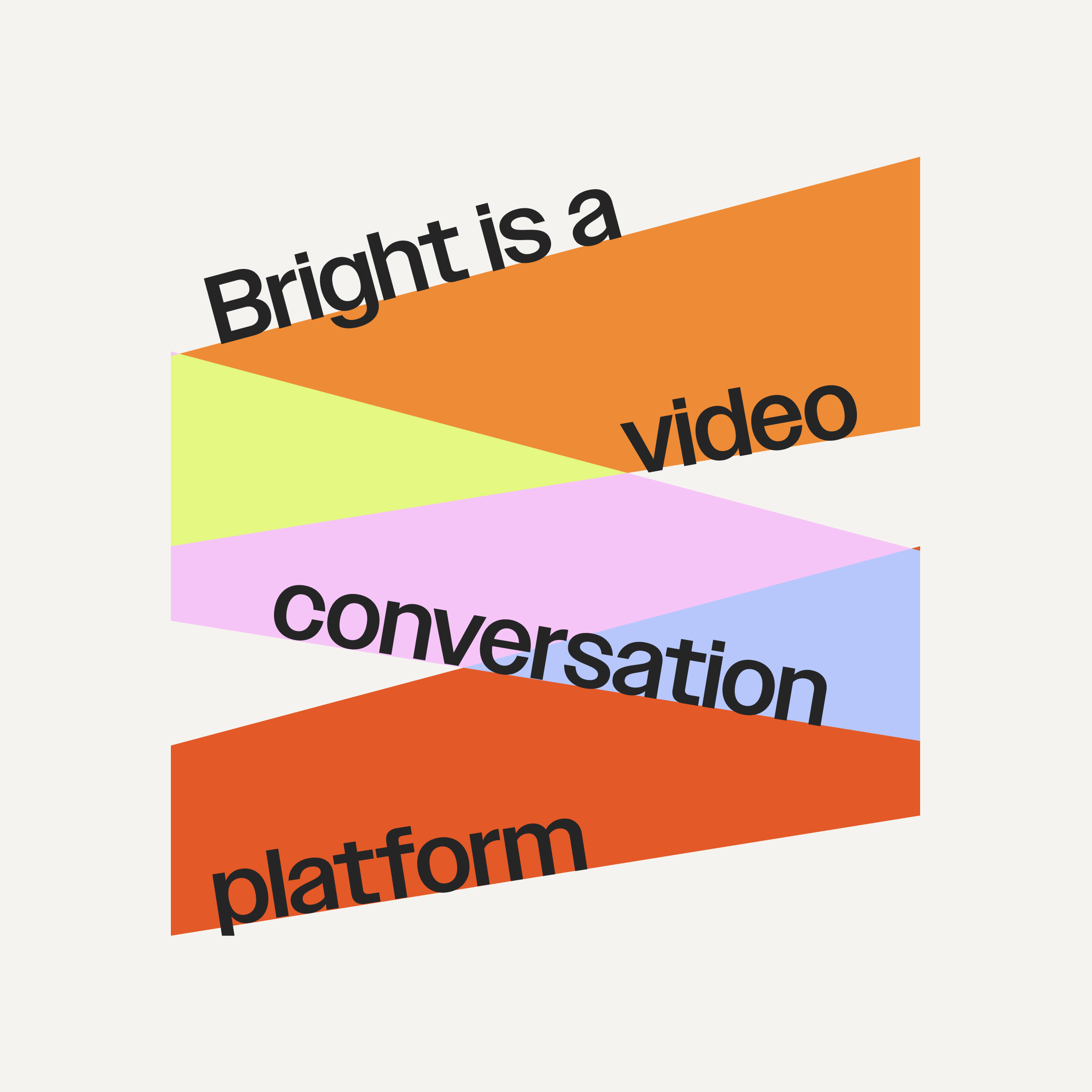
I had the opportunity to work with Bright, a tech startup specializing in a live video conversation platform for learning. The goal of a new brand identity was to define and refine the brand's essence, values, and visual representation. We identified the need to focus on our human-first creators and elevate them to the forefront to create a sense of approachability and credibility. With Bright's new personality, we transformed the platform into a friendly, eccentric, and playful space for both users and creators to engage with one another.
I had the opportunity to work with Bright, a tech startup specializing in a live video conversation platform for learning. The goal of a new brand identity was to define and refine the brand's essence, values, and visual representation. We identified the need to focus on our human-first creators and elevate them to the forefront to create a sense of approachability and credibility. With Bright's new personality, we transformed the platform into a friendly, eccentric, and playful space for both users and creators to engage with one another.
ROLE
As the brand designer, I was responsible for spearheading the rebranding efforts and develop captivating seasonal campaigns to increase exposure for Bright. I worked closely with the our marketing team to understand their vision and translate it into visually engaging designs.


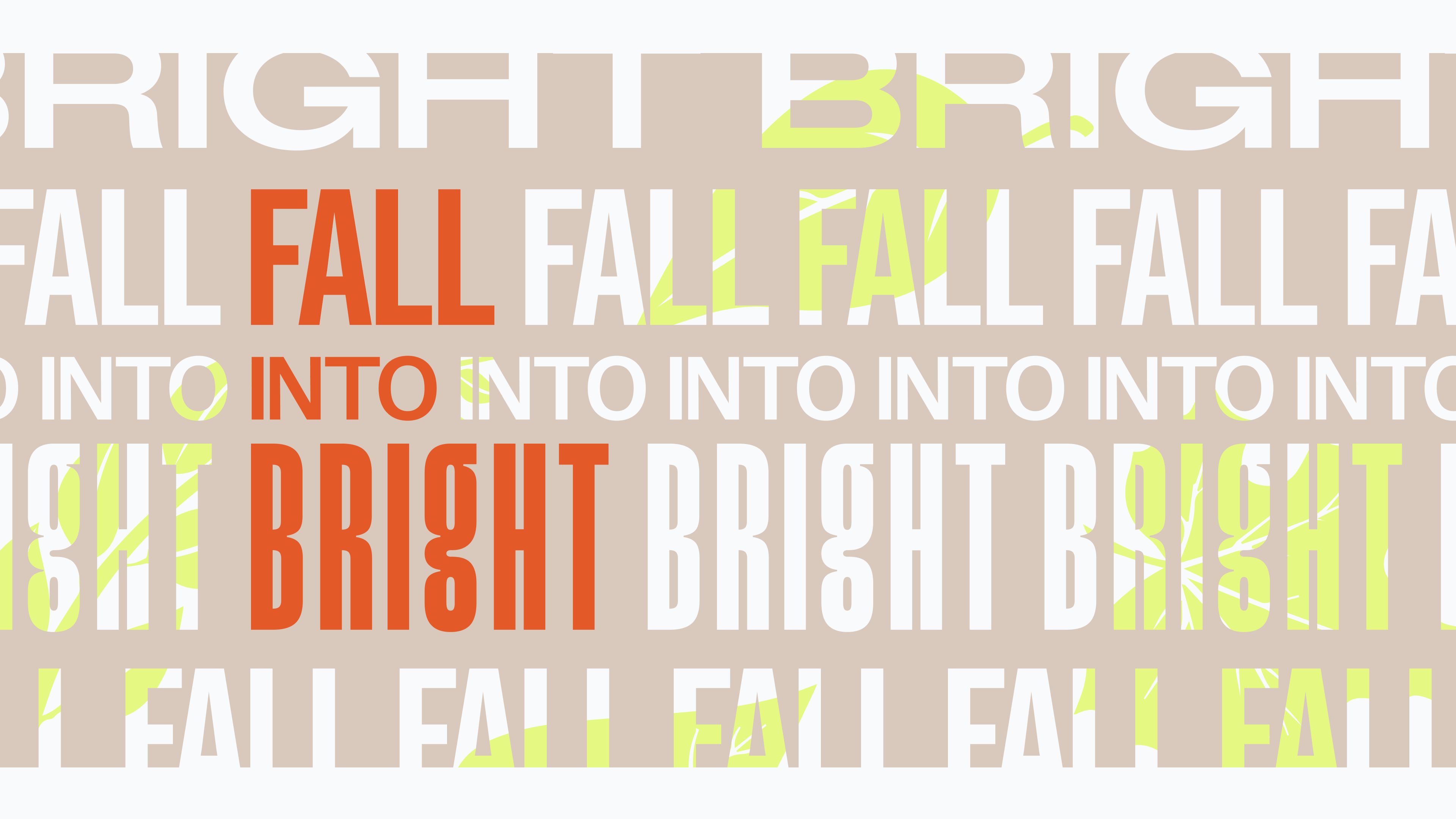
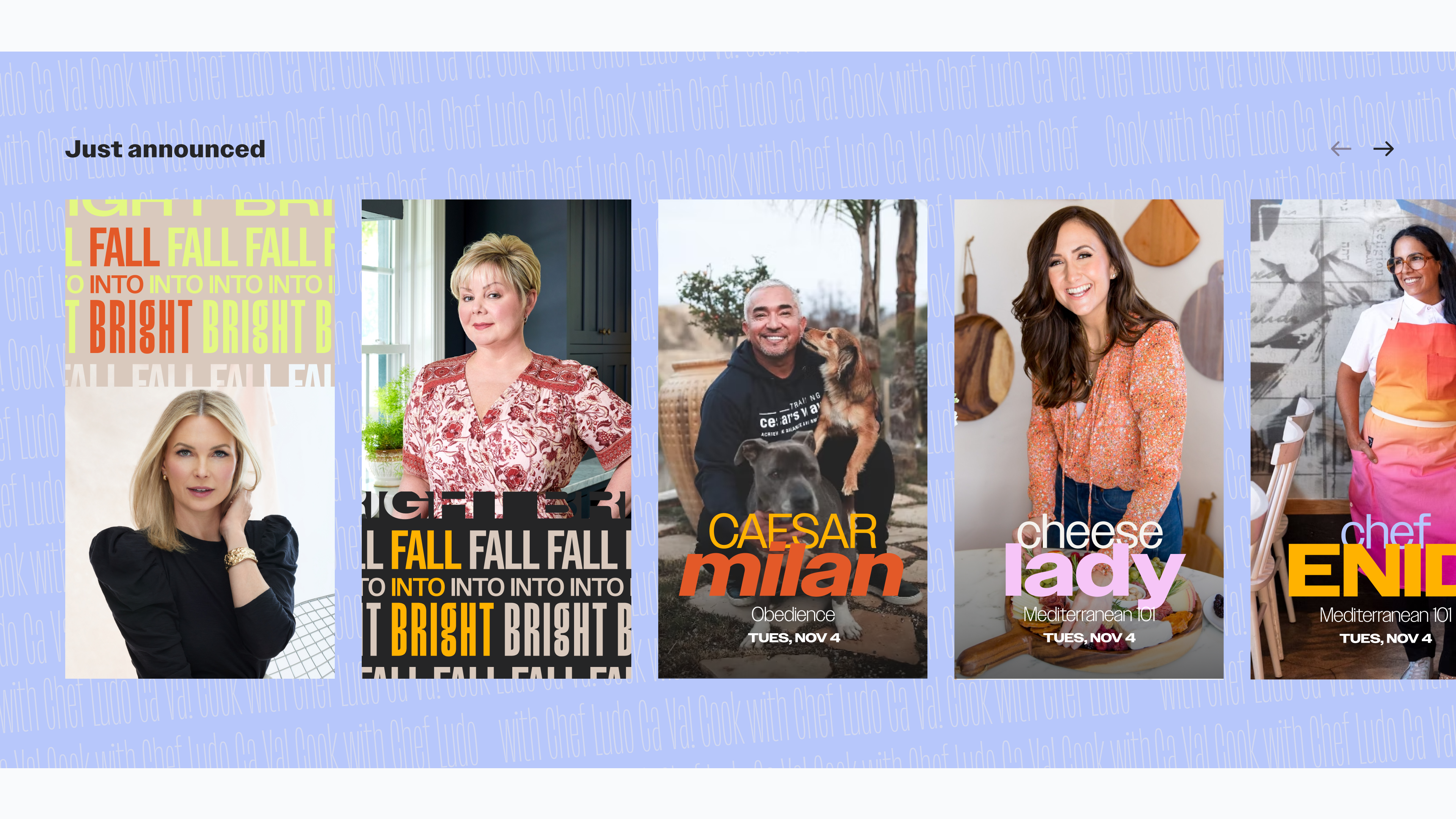
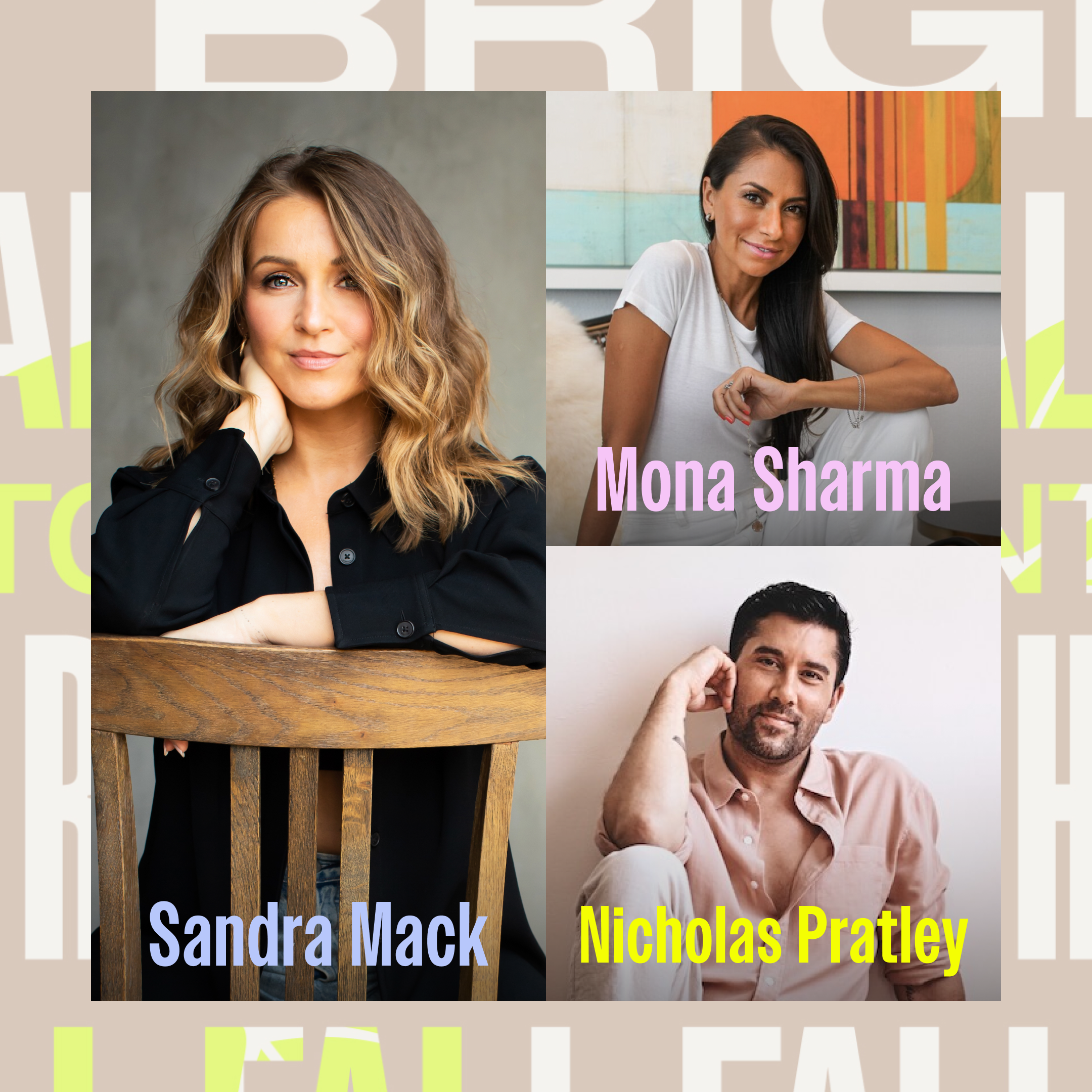
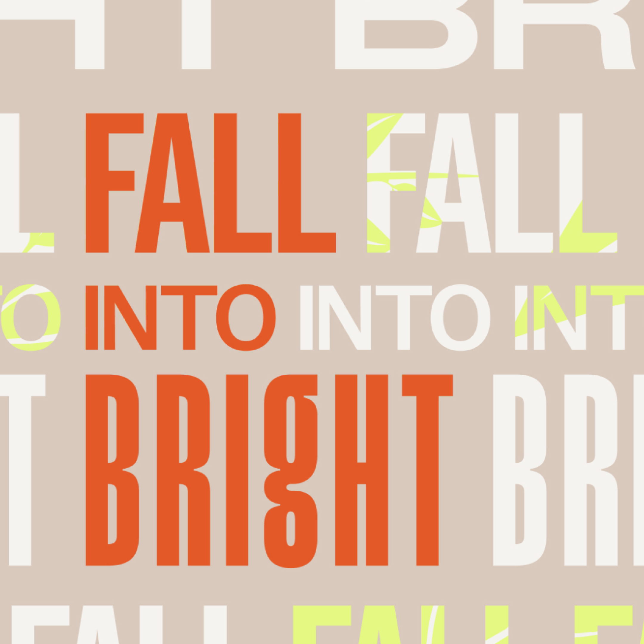
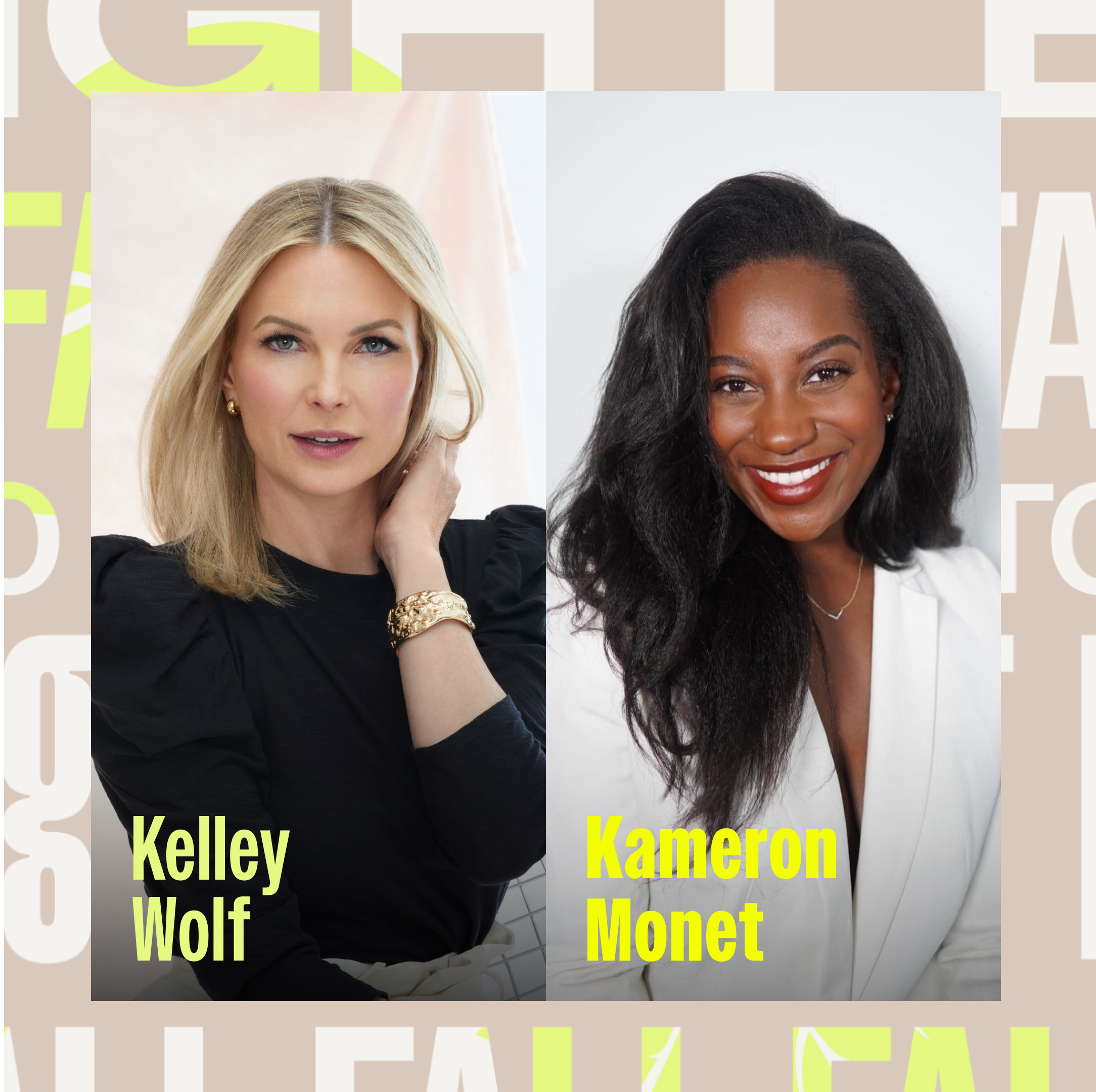
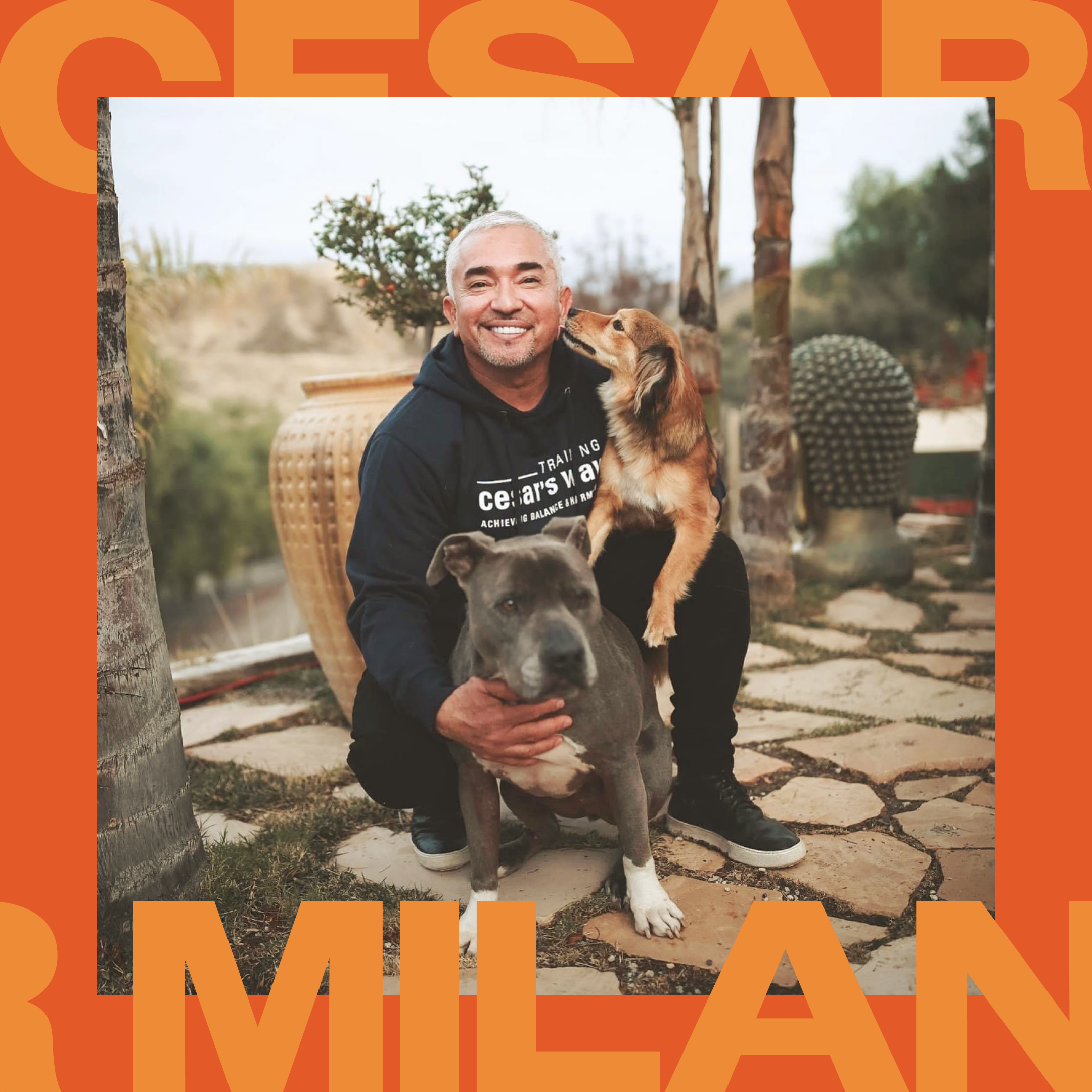
FALL CAMPAIGN 2022
"Fall into Bright" is a captivating fall campaign that focuses on personal growth, embracing change, and finding inspiration in the autumn season. The campaign aims to connect our audience with their favorite creators on Bright, fostering face-to-face interactions and offering guidance and support as they navigate various aspects of their lives.
As Bright's inaugural external campaign, I focused on incorporating new visual elements and added captivating leaf illustrations to showcase the beauty of the season. Additionally, I incorporated our iconic supporting text texture as a prominent element, highlighting some of Bright's new identity changes. Below, you can find creator cards featuring the campaign theme on our homepage, as well as Instagram posts during the seasonal campaign.


︎ CREDITS
︎ Client / Bright
︎ Tools / Figma, Photoshop, Illustrator
︎ Date / September 2022
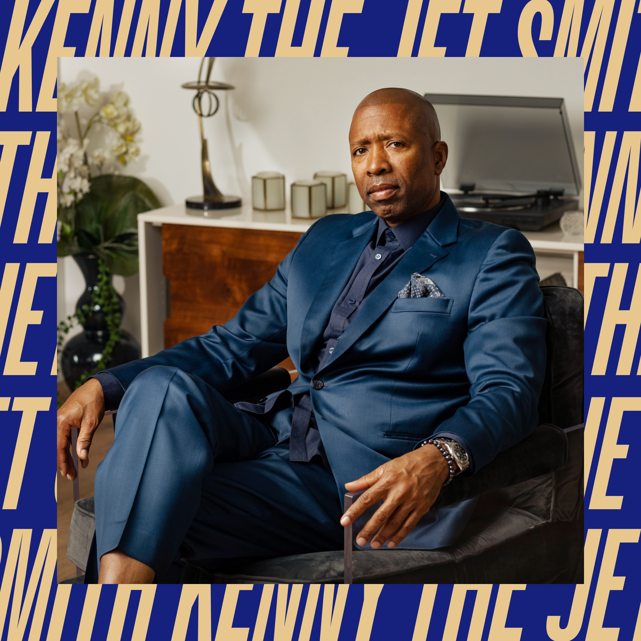
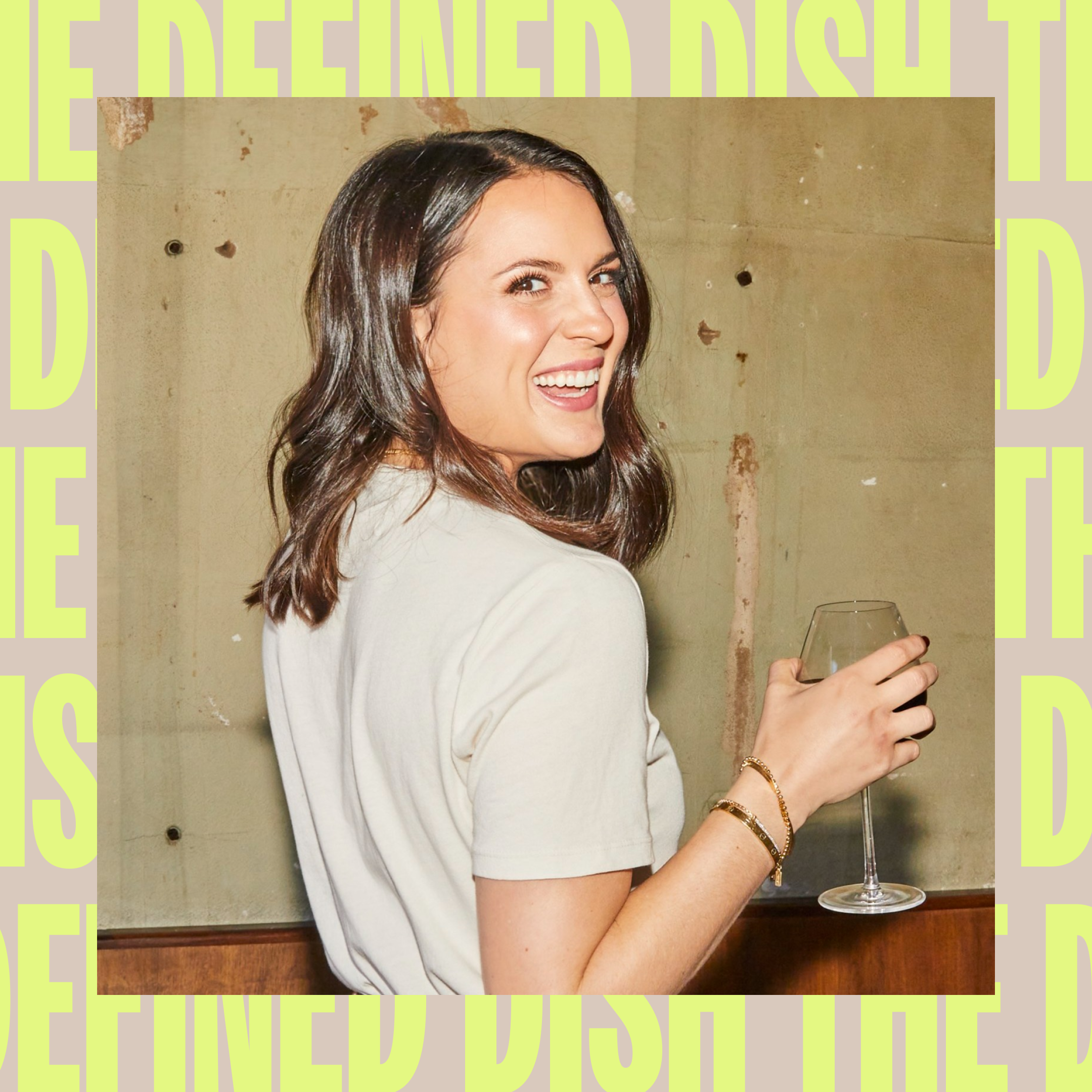
TPD .Century21_The_Relentless ______ 002 ︎
Podcast Design
& Art Direction
OVERVIEW
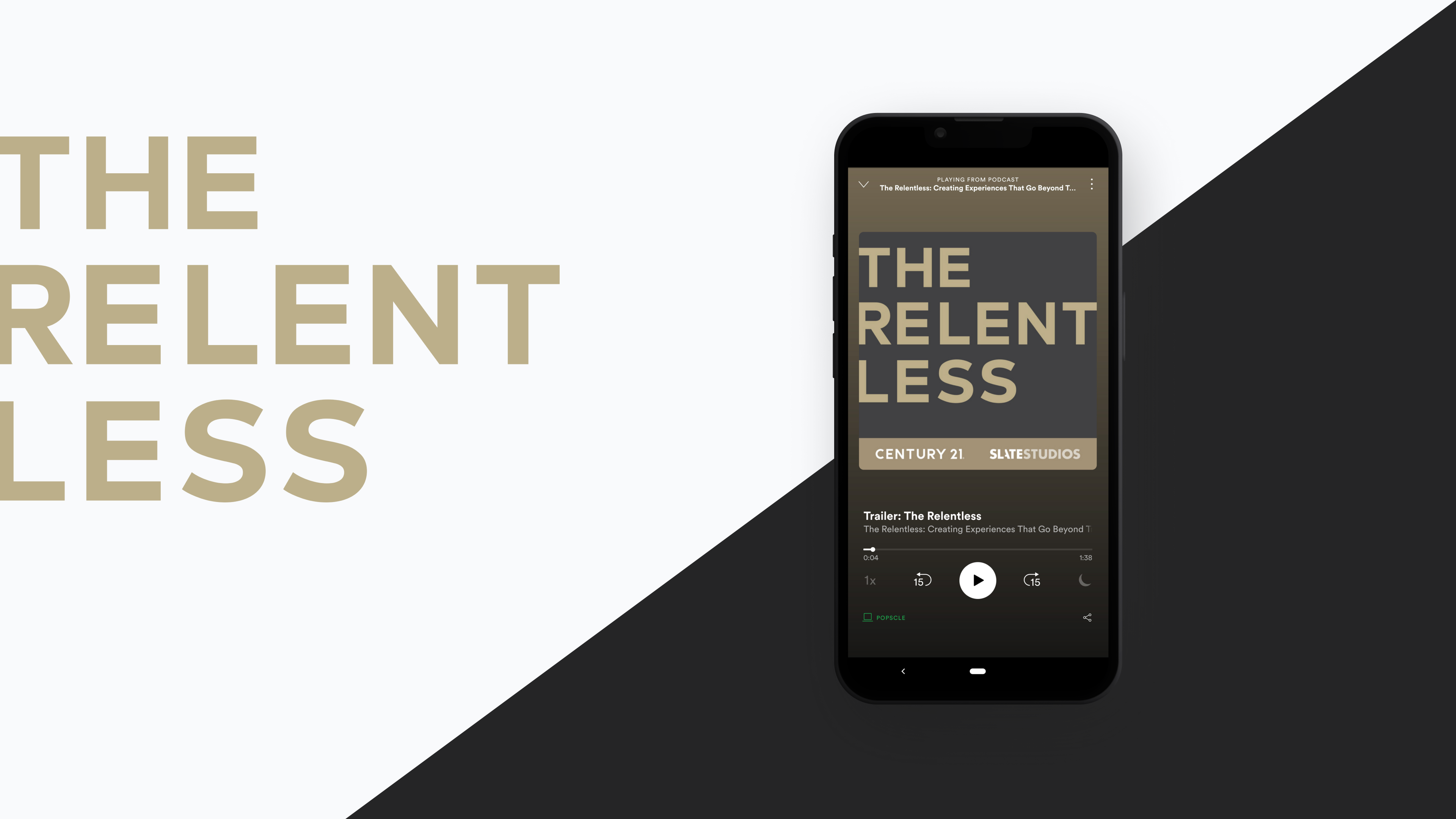
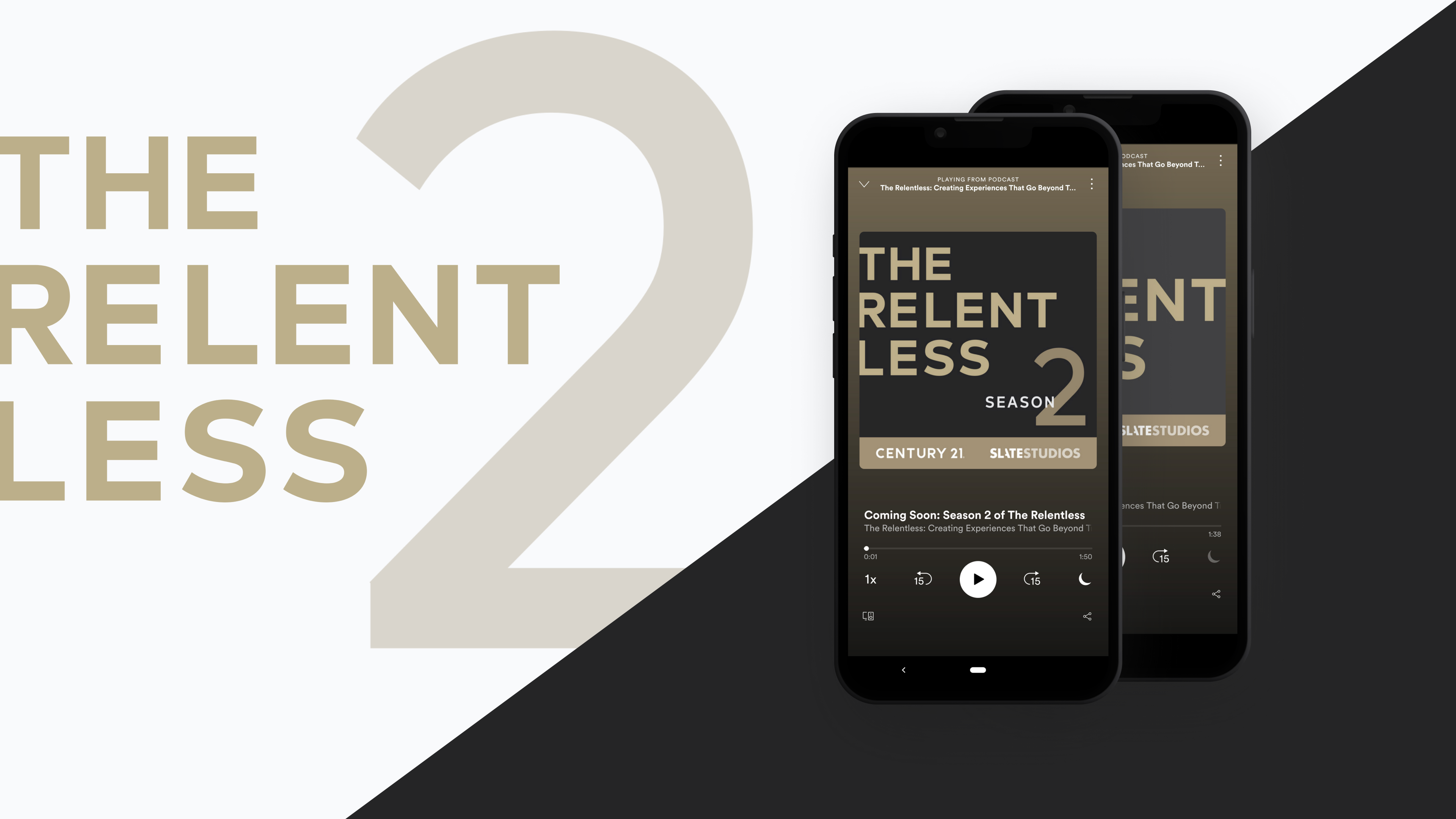
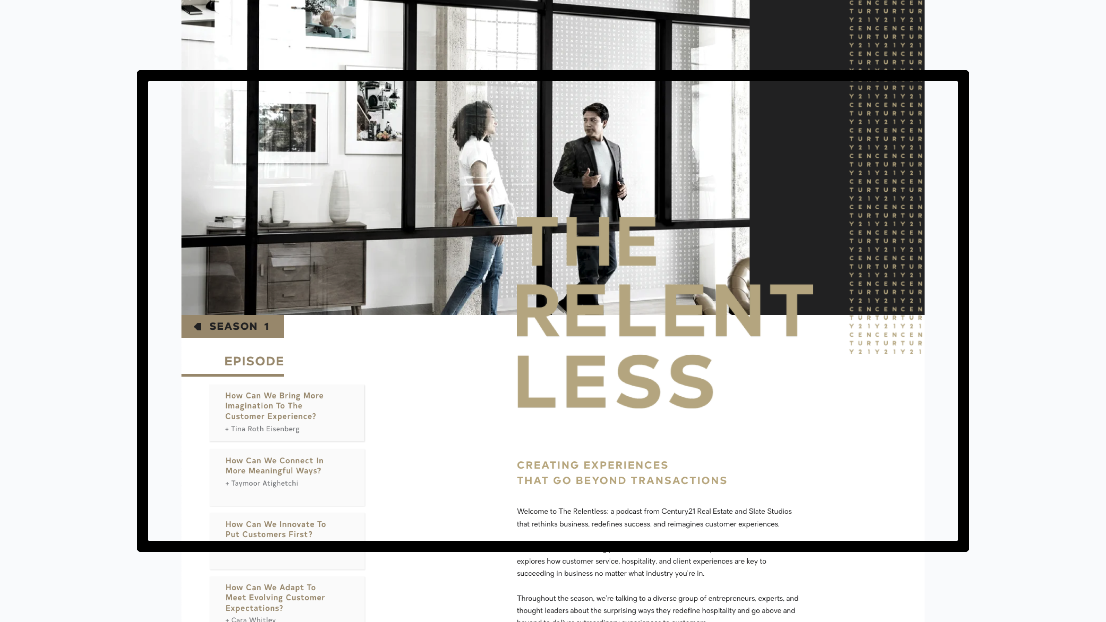
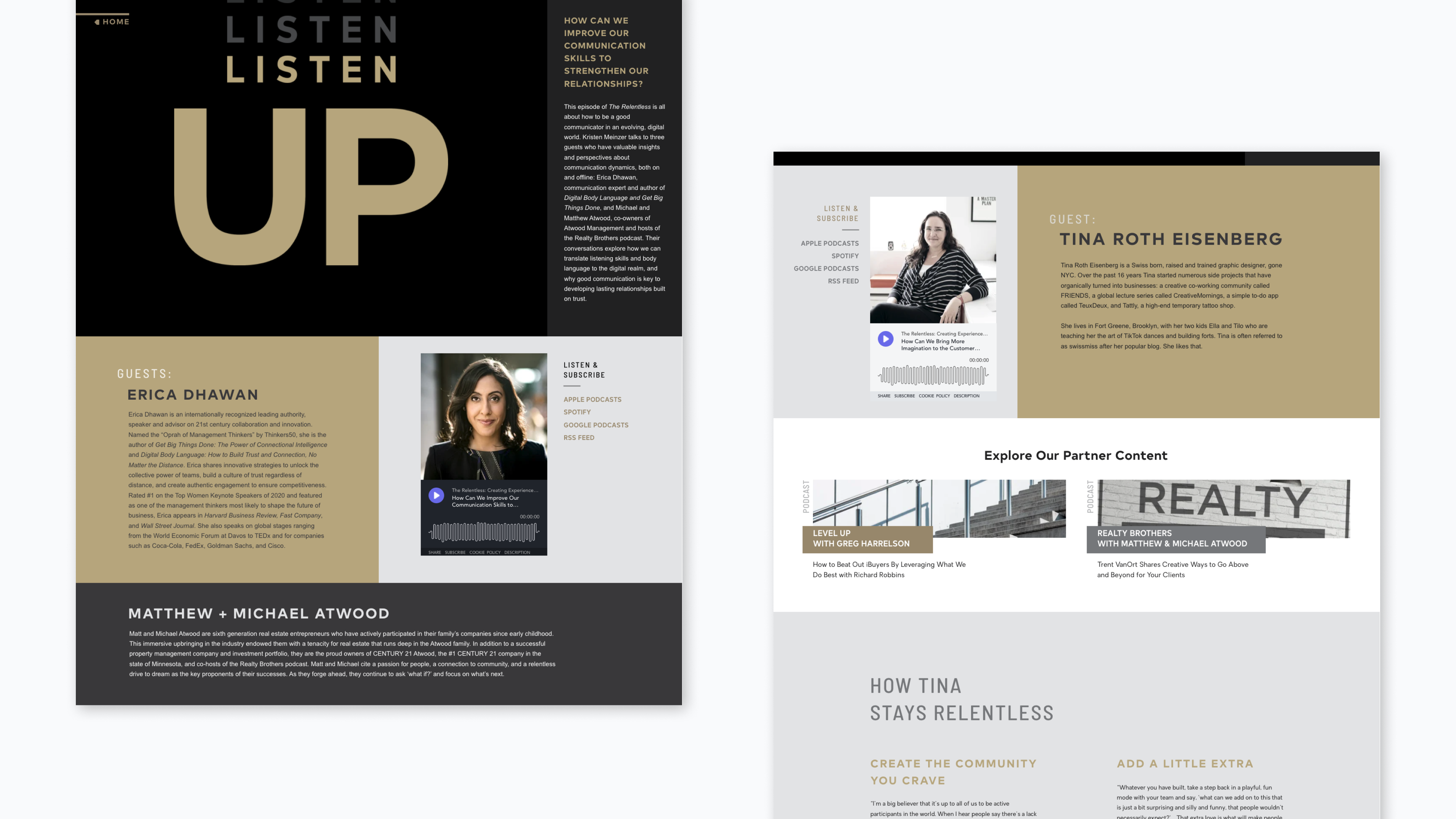
Produced by Slate Studios and Century 21, "The Relentless" is a powerful and inspiring audio series that delves into the world of real estate, entrepreneurship, and the relentless pursuit of success. This collaboration seamlessly combines Century 21's expertise in the real estate industry with Slate Studios's reputation for thought-provoking and captivating content, all into a podcast. With 3 successful seasons, The Relentless has become a go-to resource for listeners seeking engaging storytelling, expert interviews, and insightful discussions.
Produced by Slate Studios and Century 21, "The Relentless" is a powerful and inspiring audio series that delves into the world of real estate, entrepreneurship, and the relentless pursuit of success. This collaboration seamlessly combines Century 21's expertise in the real estate industry with Slate Studios's reputation for thought-provoking and captivating content, all into a podcast. With 3 successful seasons, The Relentless has become a go-to resource for listeners seeking engaging storytelling, expert interviews, and insightful discussions.
ROLE
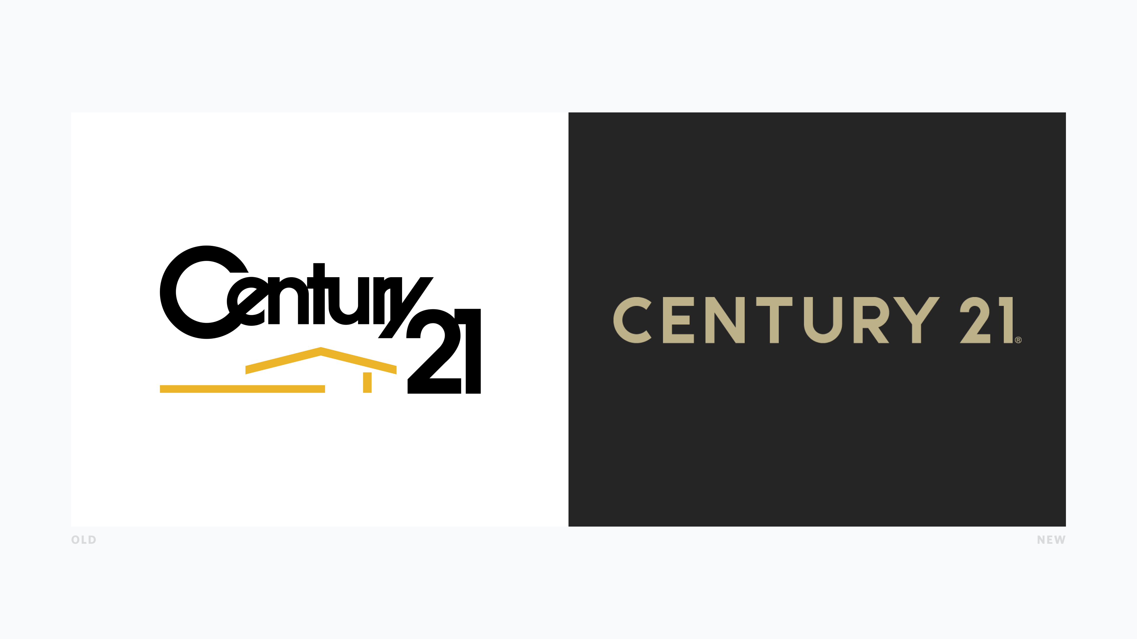
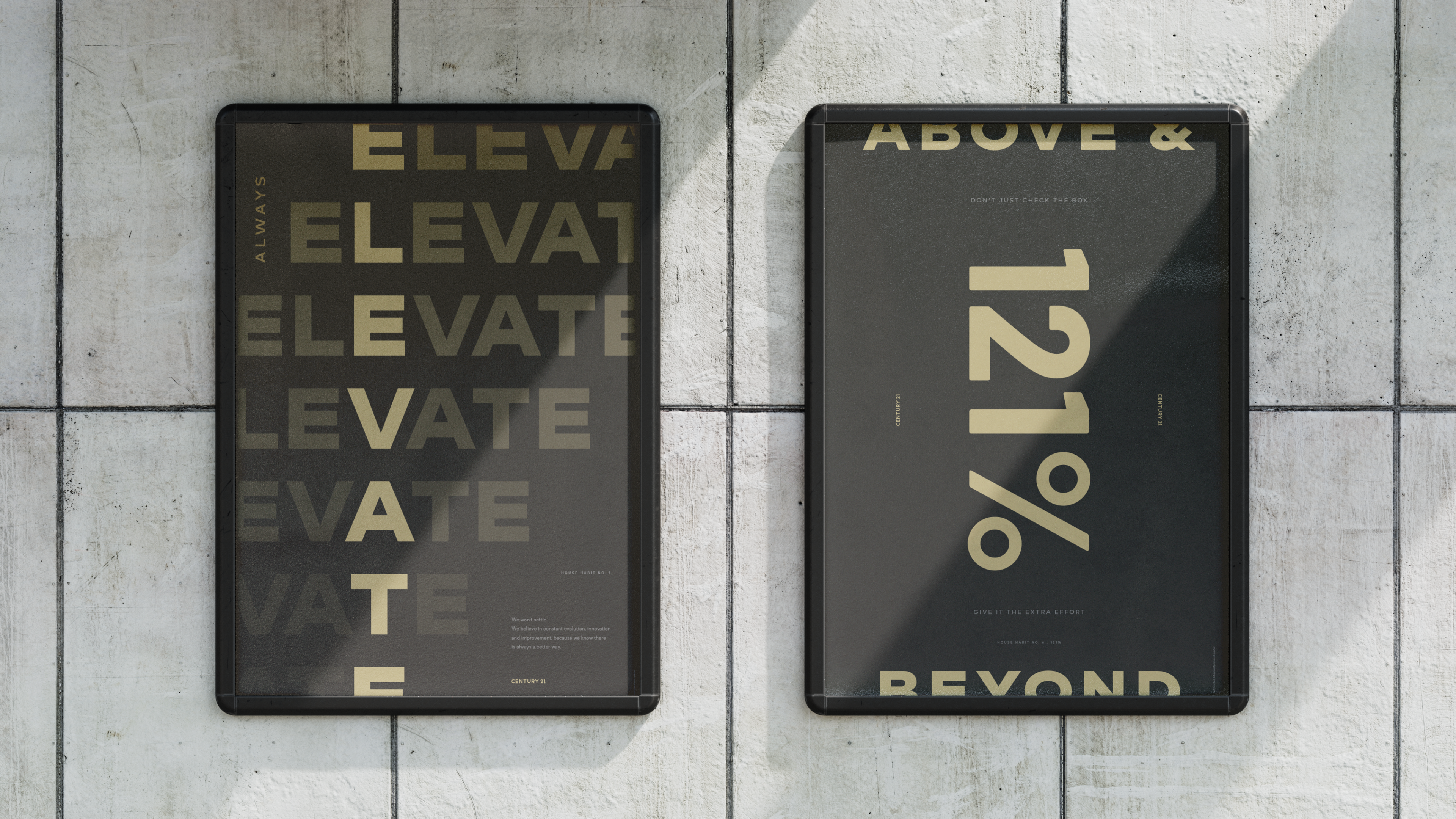
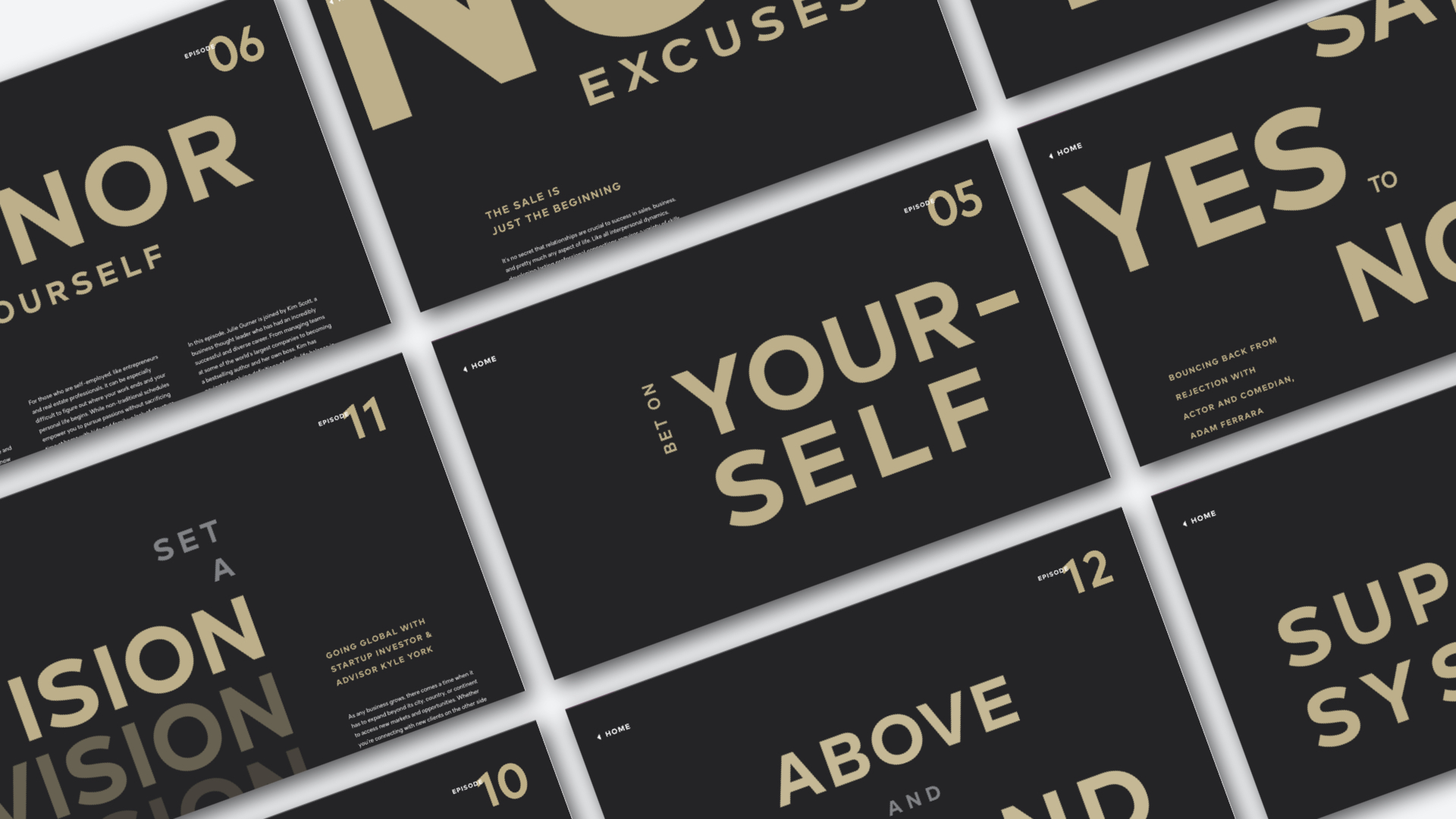
As the lead designer for Century 21's The Relentless, I had the privilege of crafting a captivating and immersive audio experience for the brand. Working closely with the podcast team, I created visually compelling cover art that instantly grabs attention and reinforces the podcast's brand recognition. From episode artwork to show notes and promotional graphics, I ensured a seamless and visually appealing experience for the listeners. This project showcased my ability to translate brand identity into the world of podcast design, elevating Century 21's storytelling and enhancing their new brand narrative.
As the lead designer for Century 21's The Relentless, I had the privilege of crafting a captivating and immersive audio experience for the brand. Working closely with the podcast team, I created visually compelling cover art that instantly grabs attention and reinforces the podcast's brand recognition. From episode artwork to show notes and promotional graphics, I ensured a seamless and visually appealing experience for the listeners. This project showcased my ability to translate brand identity into the world of podcast design, elevating Century 21's storytelling and enhancing their new brand narrative.
.
︎ CREDITS
︎ Client / Century 21
︎ Tools / Ceros, Sketch, Adobe Ps, Ai, Ae
︎ Date / 2019—2021
TPD .Slate_Redesign ______ 004 ︎


OVERVIEW
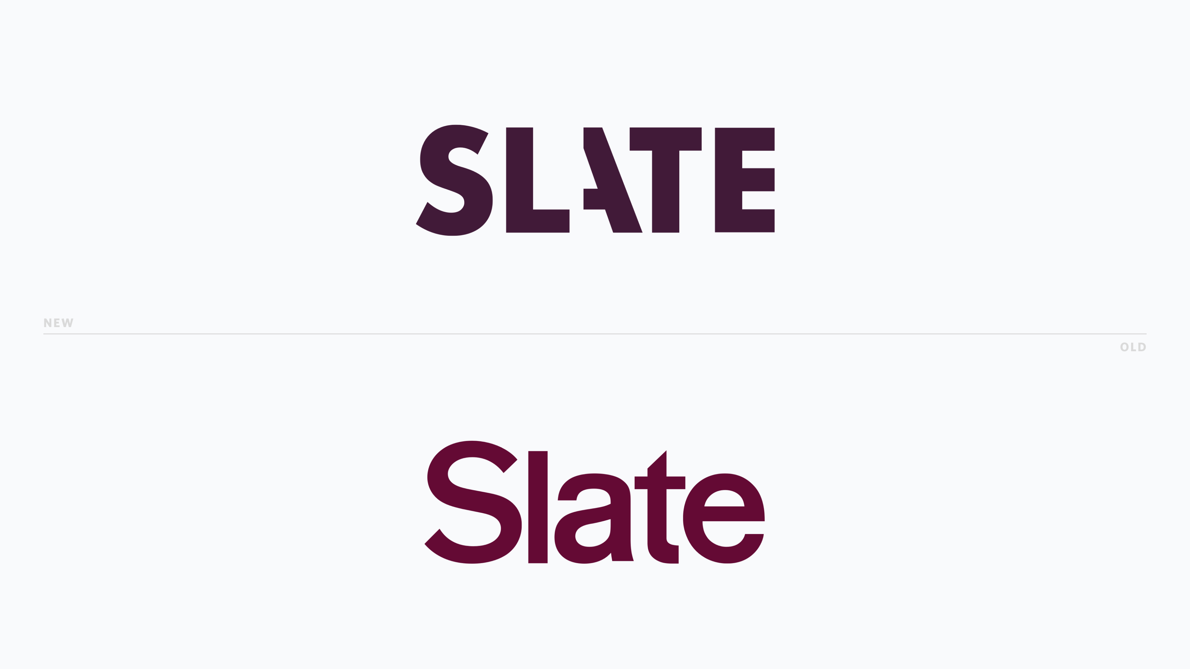
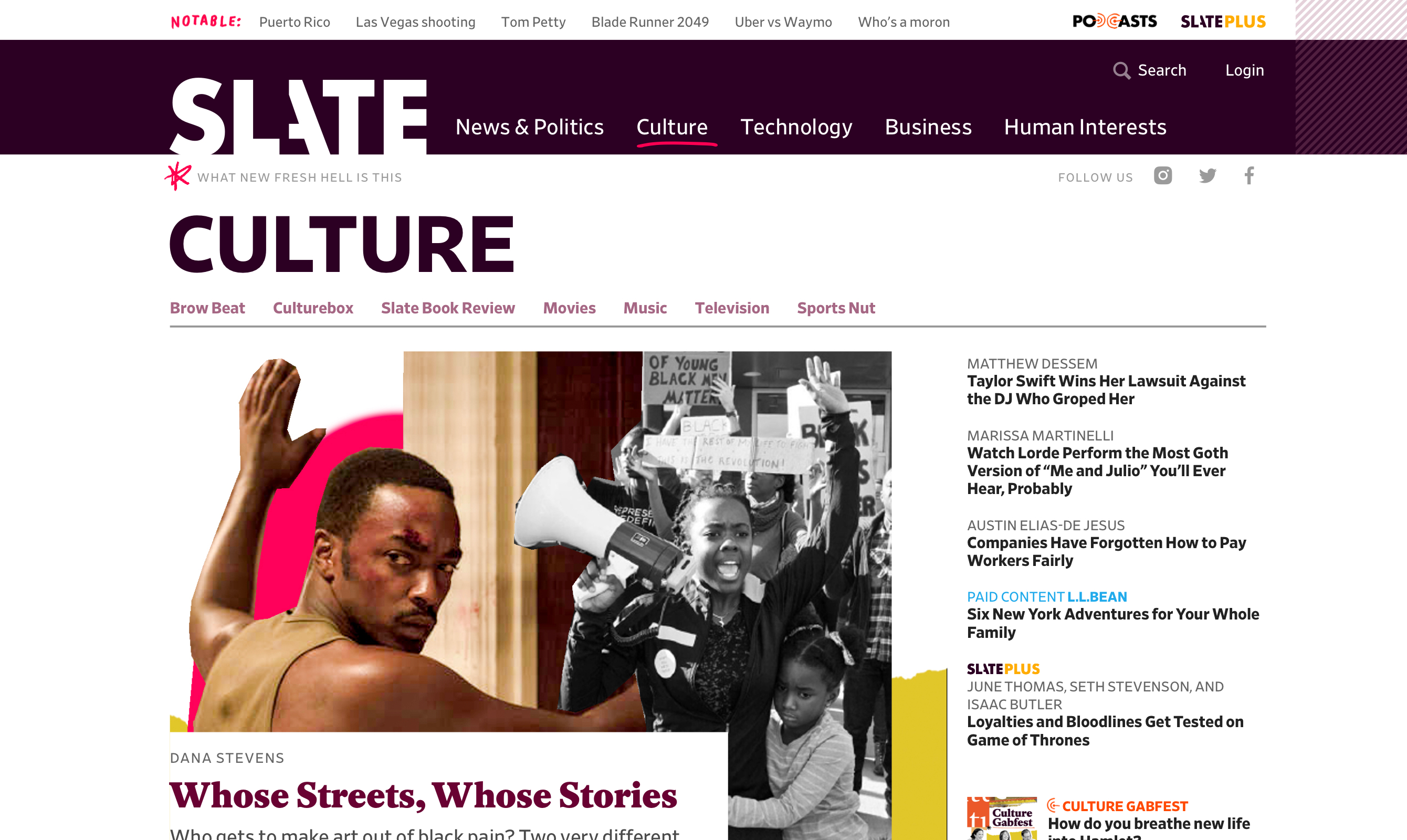
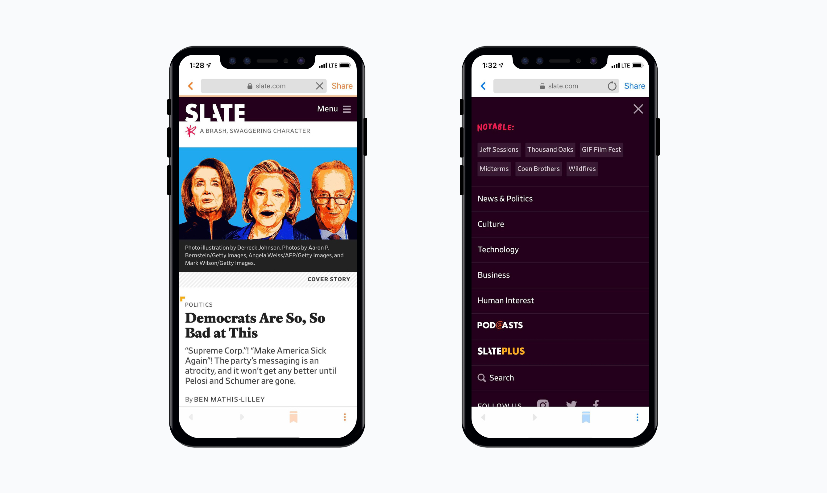
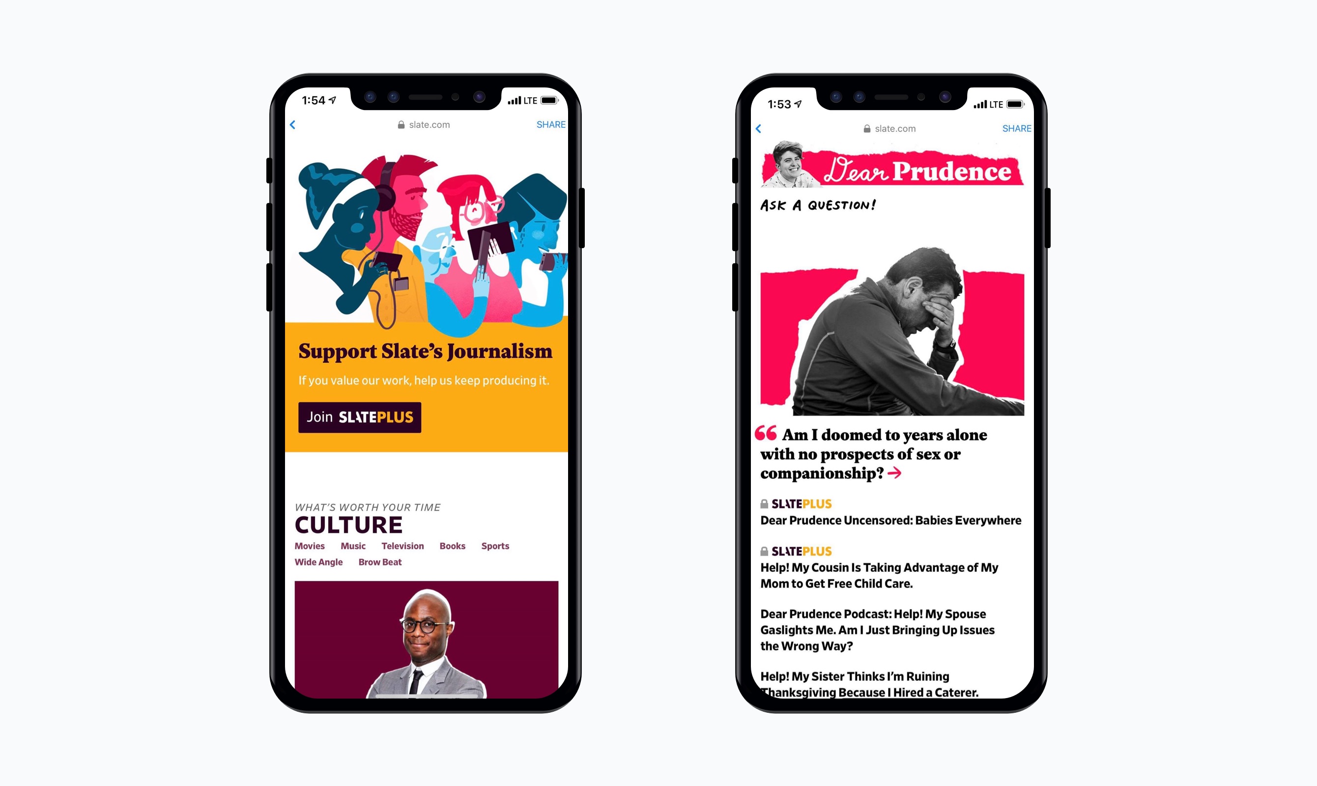
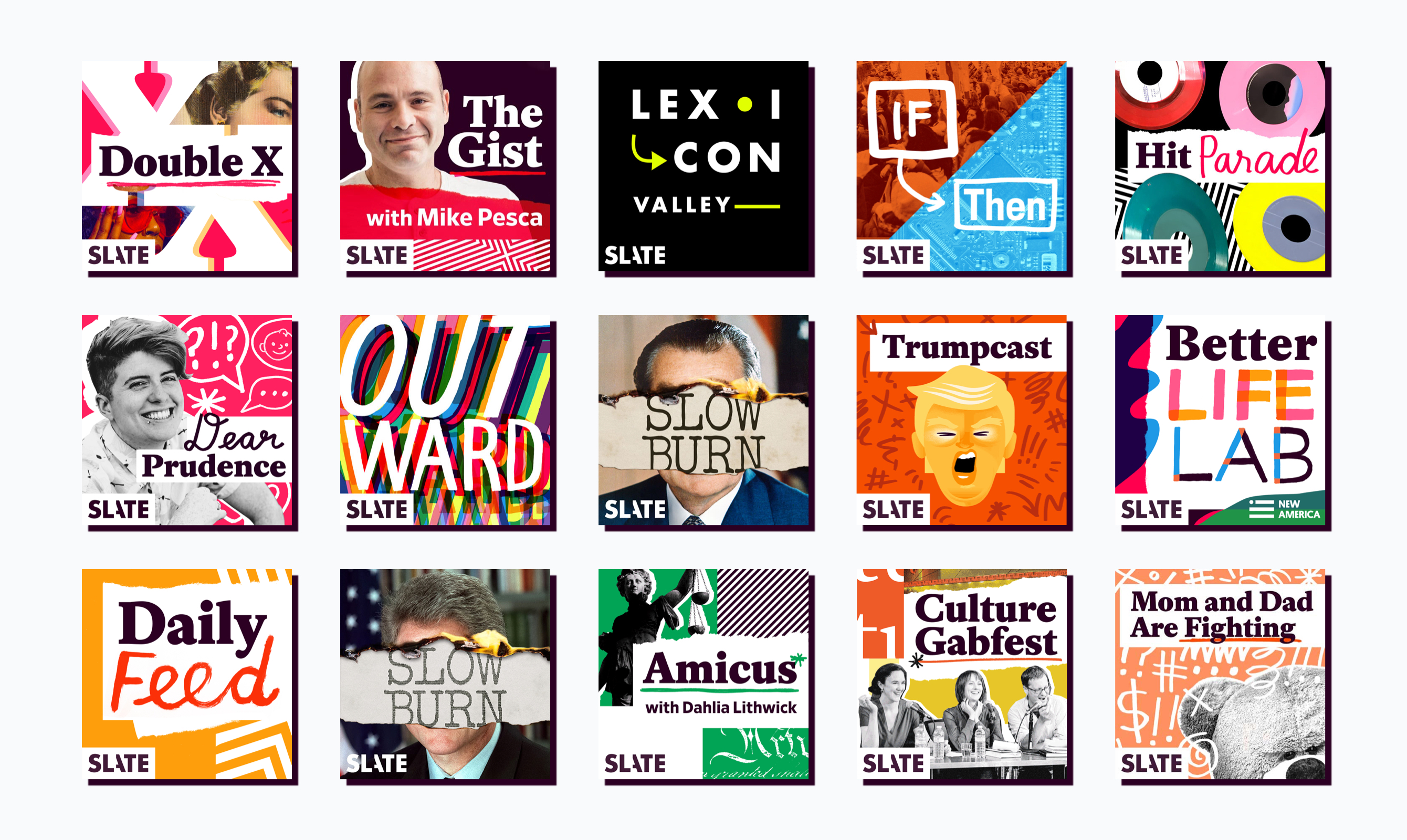
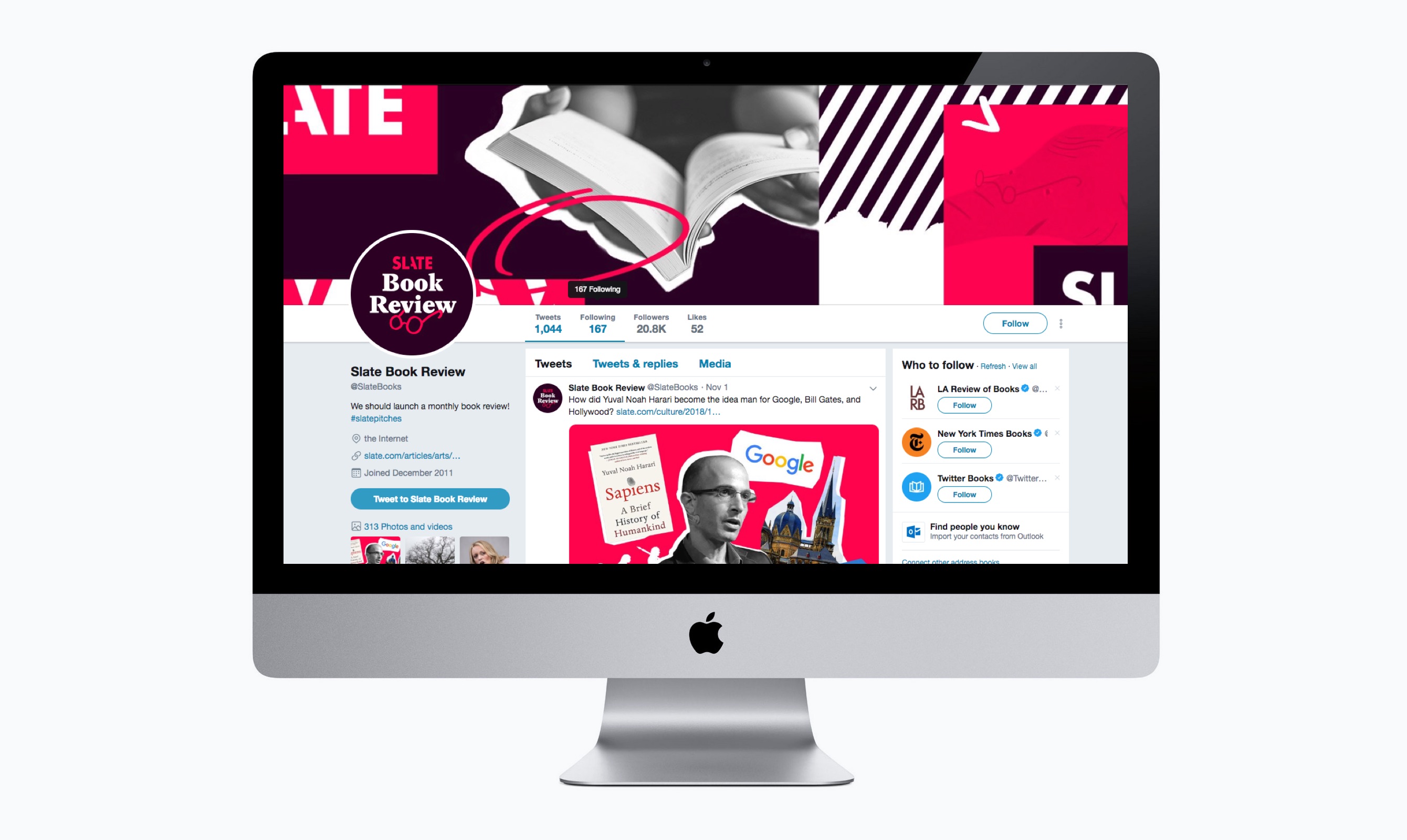
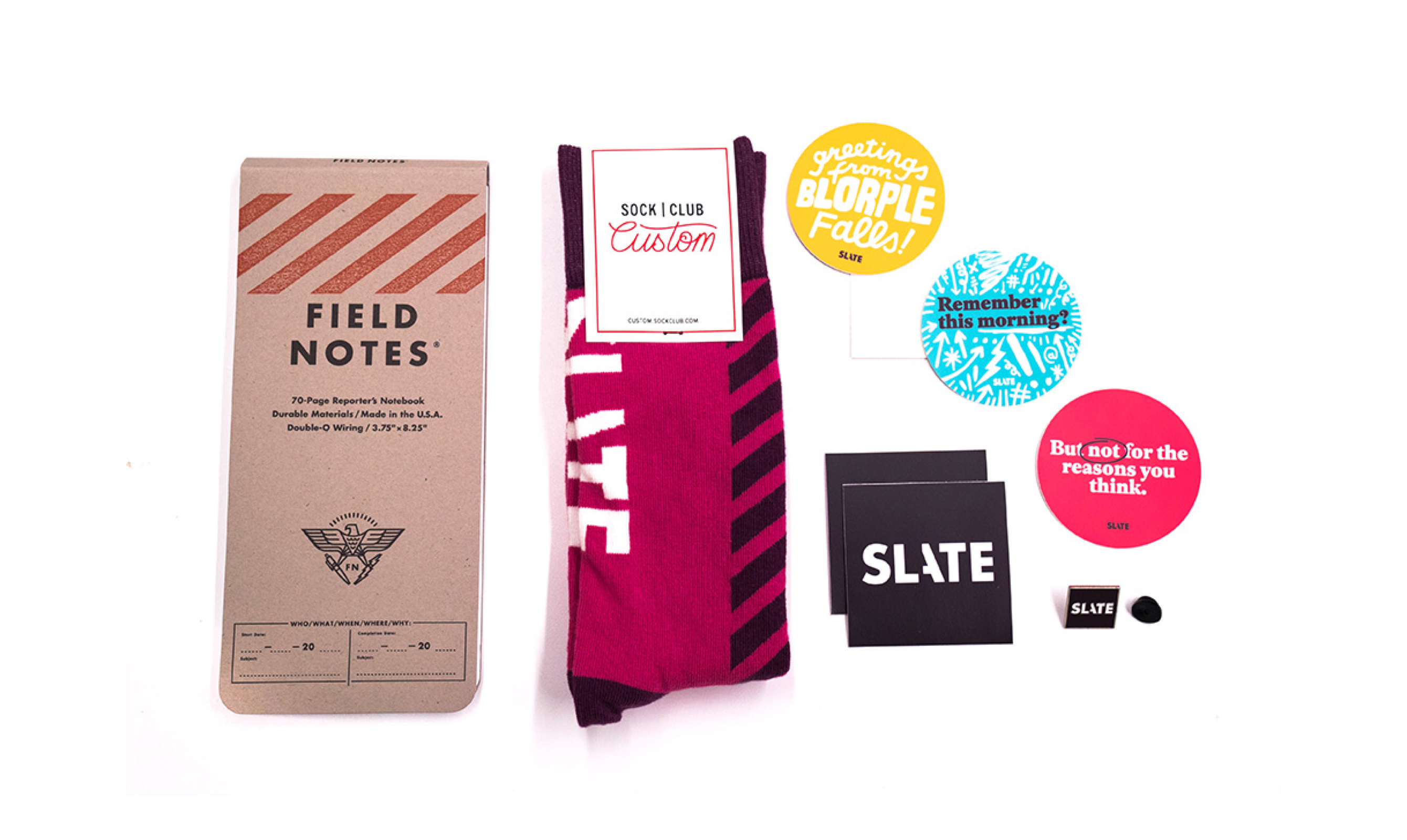
The Slate rebrand stands as a testament to the power of transformation and innovation in the world of media. This comprehensive and ambitious project encompassed a complete overhaul of Slate's visual identity, messaging, and user experience.
The Slate rebrand stands as a testament to the power of transformation and innovation in the world of media. This comprehensive and ambitious project encompassed a complete overhaul of Slate's visual identity, messaging, and user experience.
The rebranding efforts were driven by a deep understanding of Slate's core values and the need to adapt to the ever-changing media landscape. Through meticulous research, strategic design thinking, and collaboration with cross-functional teams, we crafted a modern and visually engaging brand identity that captures the essence of Slate's distinctive voice and journalistic excellence.


︎ CREDITS
︎ Client / Slate
︎ Tools / Sketch, Adobe Ps, Ai, Id, Ae, Lr
︎ Date / 2016—2018
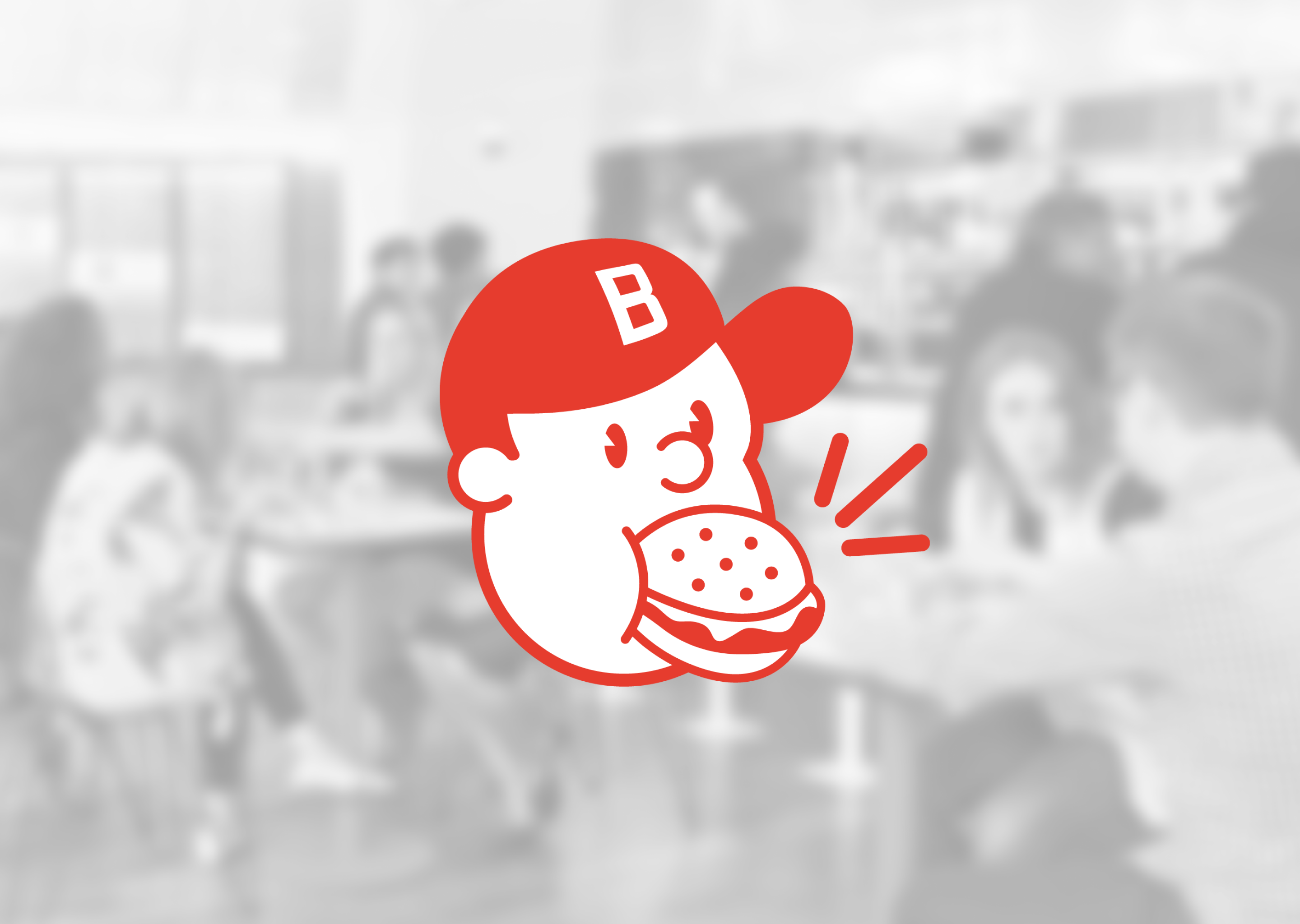
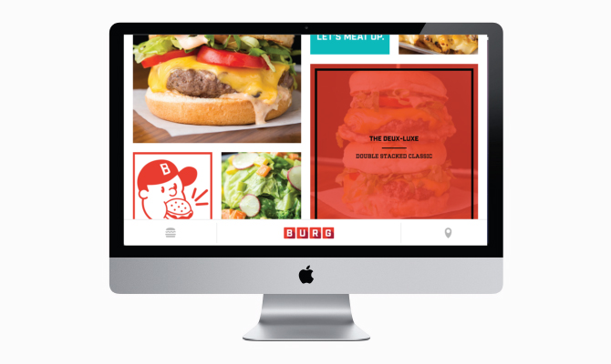
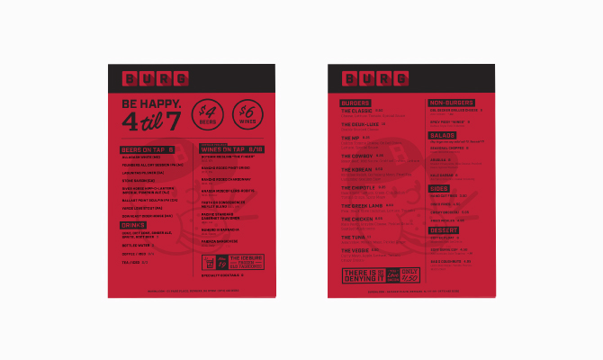
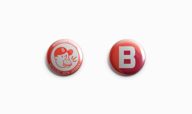
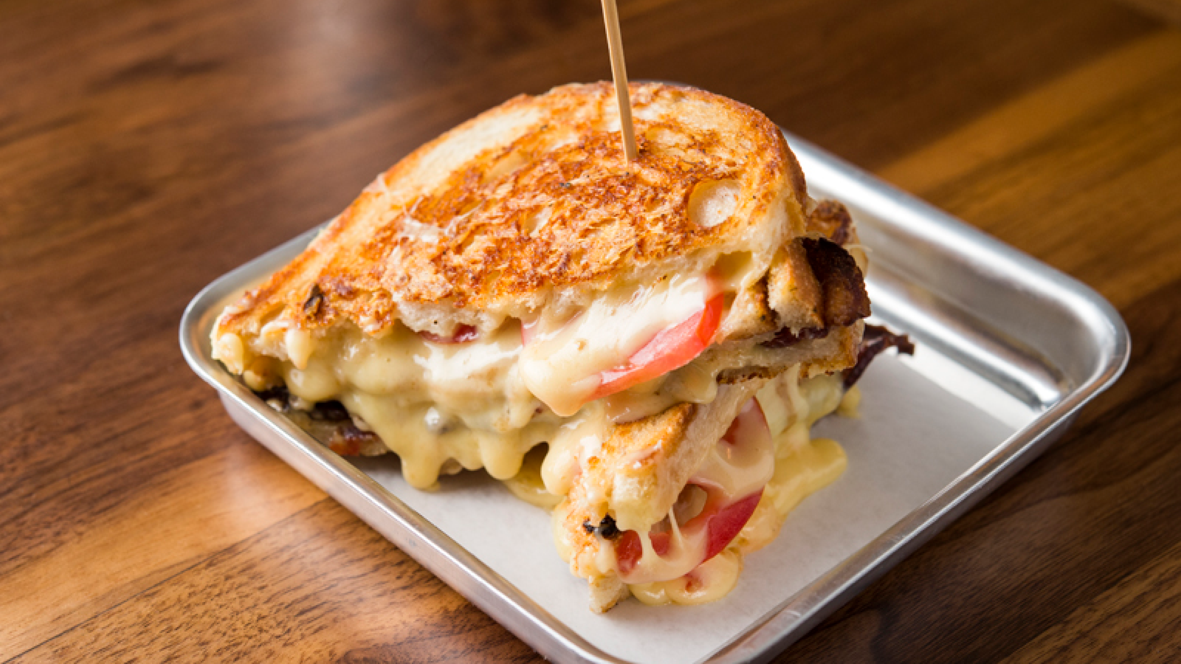
TPD .BURG ______ 006 ︎
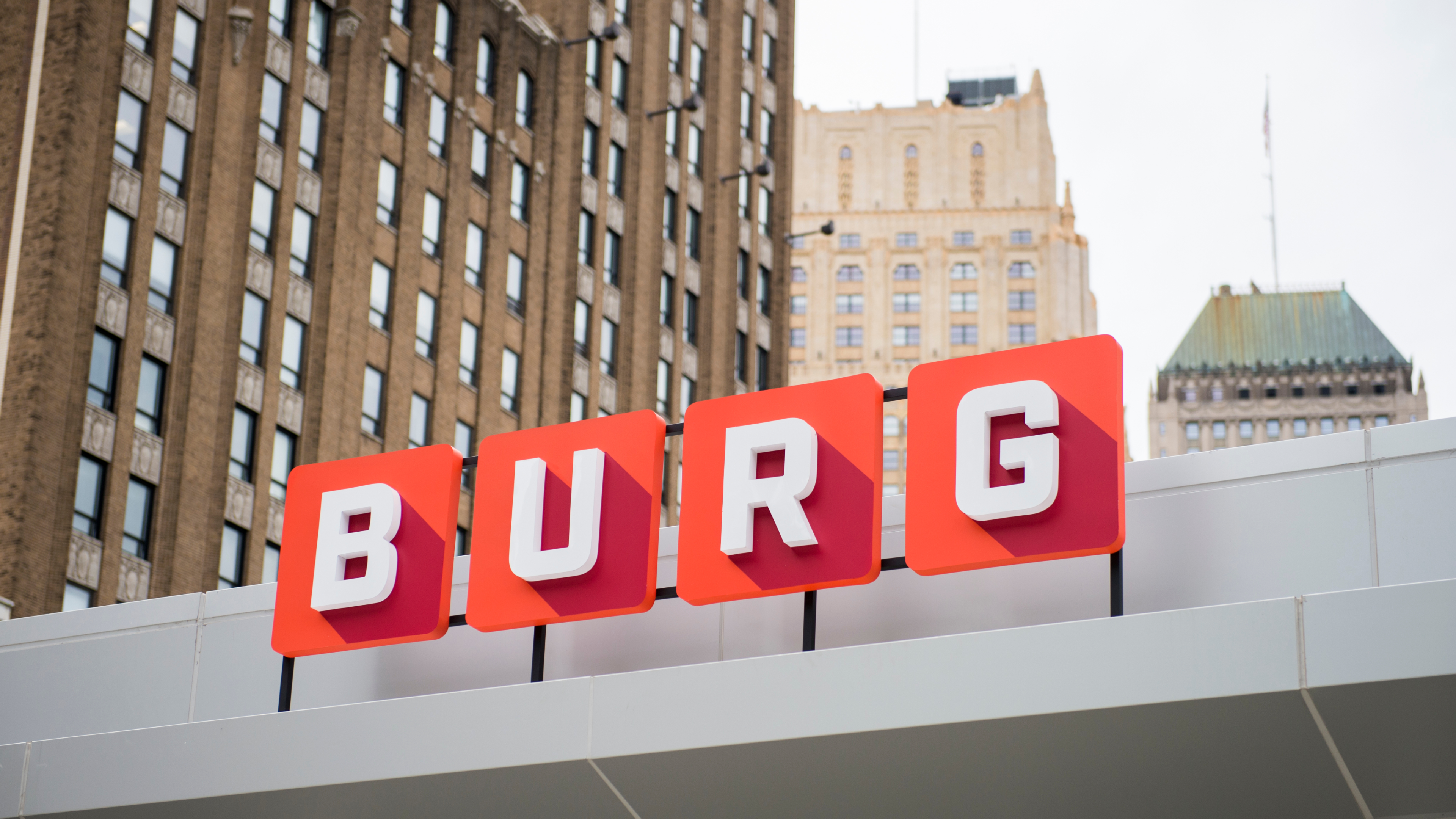
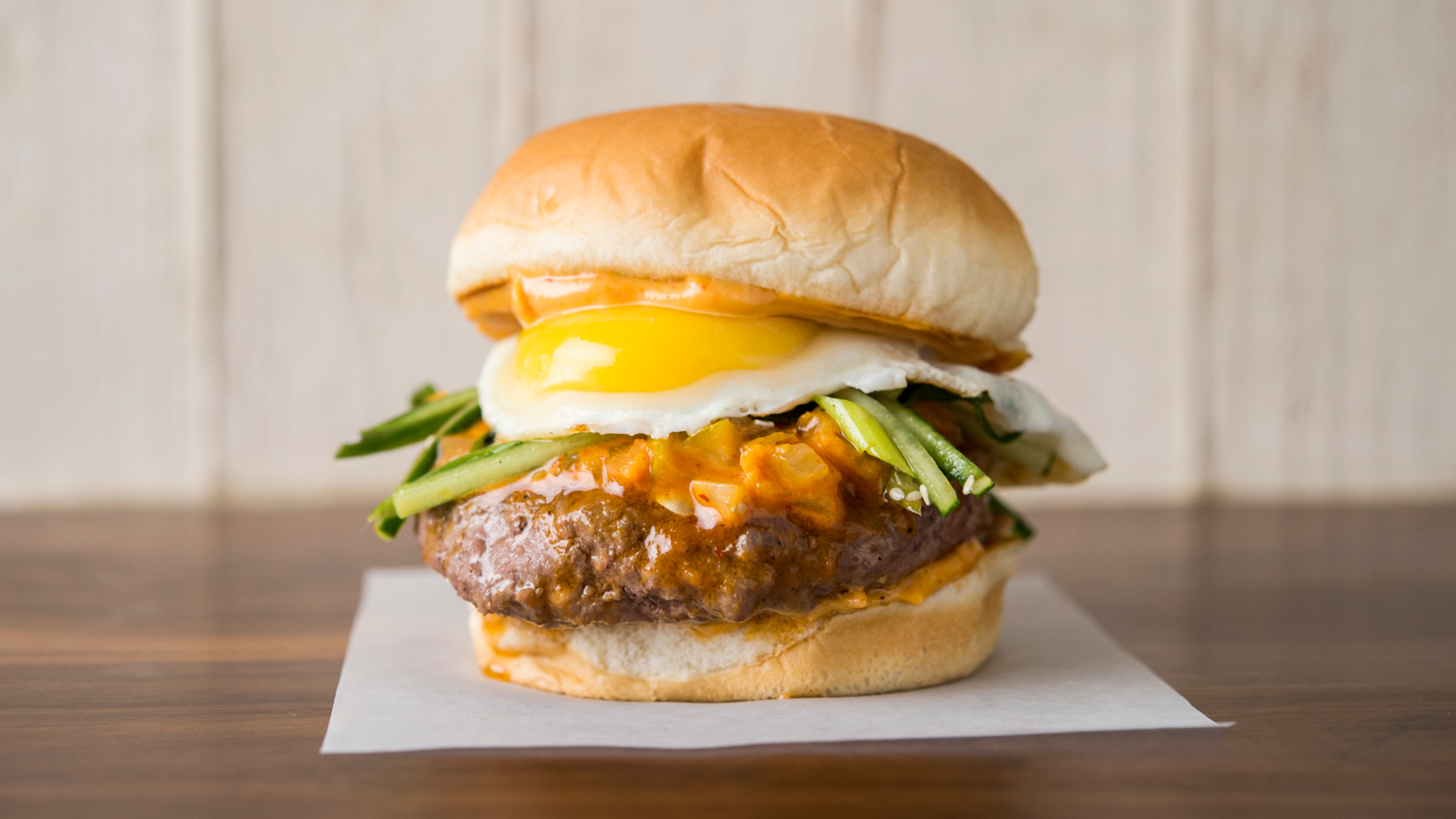
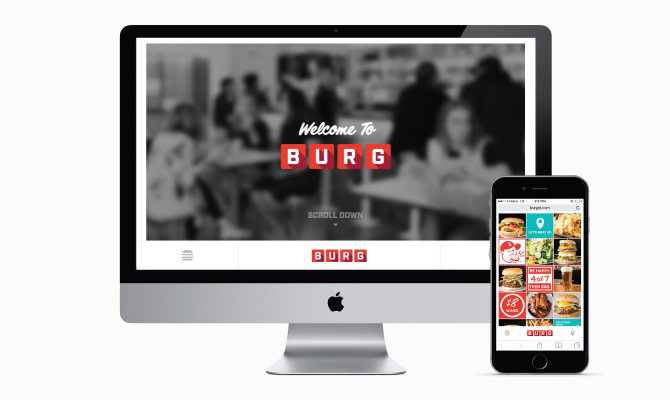
Classic Americana
Burger Joint Branding
A brand identity for a centerpiece of revitalization for Newark, New Jersey’s Military Park. Paying close attention to the classic american roadside burger joint, BURG was developed into a modern and playful concept while keeping the vintage look and feel. Collateral design includes everything from menu cards to interior signage.


︎ CREDITS
︎ Client / BURG
︎ Tools / Sketch, Adobe Ps, Ai, Ae
︎ Date / July 2015